How To Create a Responsive Table in Blogger
How To Add Table in Blogger:
if you want to Create a Responsive Table in Blogger, then you are in the right place because after reading this article, I am sure you can add a responsive table in blogger. Display website/blog must follow mobile screen size is flexible, because many of people are using gadgets to carry out its activities on the internet. The table is very important for online shopping or e-commerce blogs or websites. online shopping websites have data to add to the e-commerce comparison table. If the user has mobile price websites then it needs to add mobile specifications on the table.
on the blog or website, the HTML language is used to display data. And CSS is used to change the properties of HTML tags CSS changes the design of HTML tags, it gives more beauty to HTML tags to display more beautiful and readability to users.
We will create a responsive table in blogger by using HTML and CSS languages, don't worry if you don't know about these languages, it's super easy to create a table in blogger just by using a website. All you need to do is just design a table, that matches your requirements.
Now, I will teach you how you can create a responsive table in blogger, you need to follow some steps.
Steps To Follow: |
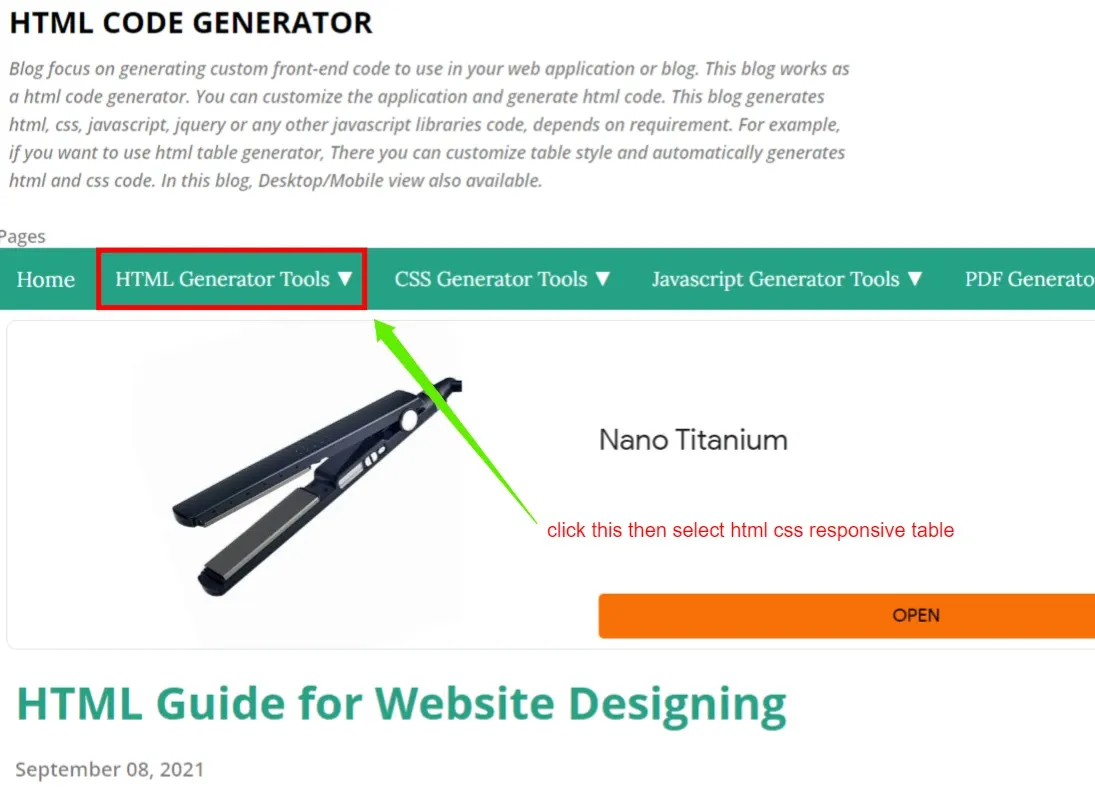
- HTML CODE GENERATOR is the website where we create a table for bloggers. Click on the HTML generator tool dropdown button then select HTML CSS responsive table.
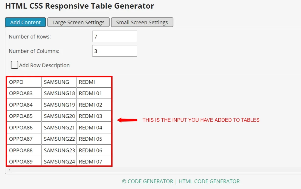
- After click on this, you will get this window to create your table for your content. the blue box shows your active tab means you can add your content below.
you can increase or decrease your rows in a number of rows line. If you want to increase the rows change the number 5 to 6,7,8, etc.
- Number of Columns:
you can increase or decrease your columns in a number of columns line. If you want to increase the columns change the numbers 5 to 6,7,8, etc. below are the example.👇👇
- In the below table, you are seeing where Head1, Head2, Head3 are written write your table headings there. below are the example.👇👇 This is your input table
👇This is the input of your table👇
 |
| This is the Output of your table for pc/laptop |
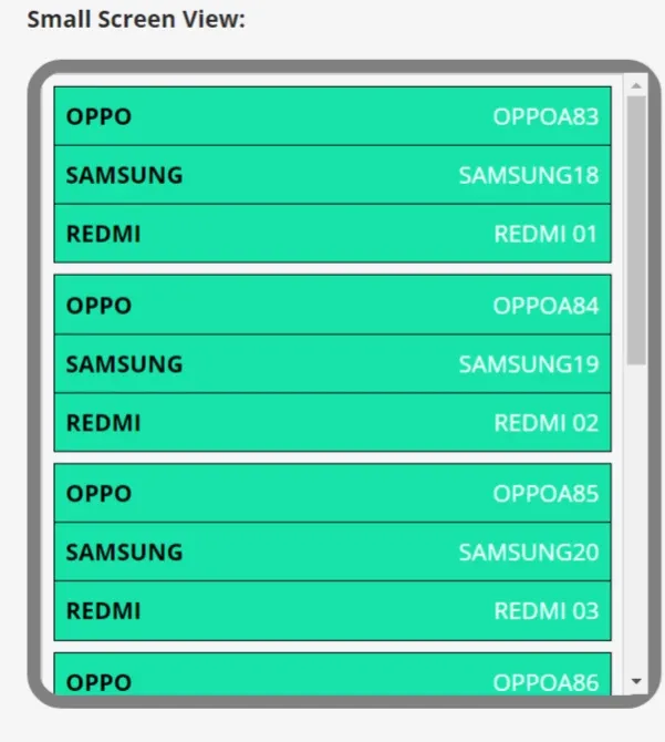
👇For Mobile Screen👇
- when it comes to customizing the table, like change colors, backgrounds, heading colors, and border colors then you need to click on the large screen setting. after this, you will get tools to change the borders of the background heading colors.
- This window will appear after you click on the large screen setting button. Change the setting as you want to style or customize. make sure the same styling you add on the small screen setting.
 |
| DESKTOP STYLING |
 |
| DESKTOP SCREEN |
SMALL SCREEN SETTING
 |
| MOBILE STYLING |
- After customizing or styling the table, it's time to add it to your blog post. to add a table into the blogger post you need a code of this table. which is below this post.
Copy the complete code from <style> to </table>
- Now Open your Blogger site post then click on the pencil on the top left corner then select HTML edit. and paste the code which you copy from the other site.
- AFTER CLICK ON THE PREVIEW BUTTON YOU WILL SEE YOUR TABLE HOW IT LOOKS LIKE.
 |
| DESKTOP PREVIEW |
 |
| MOBILE PREVIEW |
That's it guys if you did the same thing. or you have any problems comment me in this post. I will tell you the solution as soon as possible.
Tags
Blogging


